How to camouflage a building
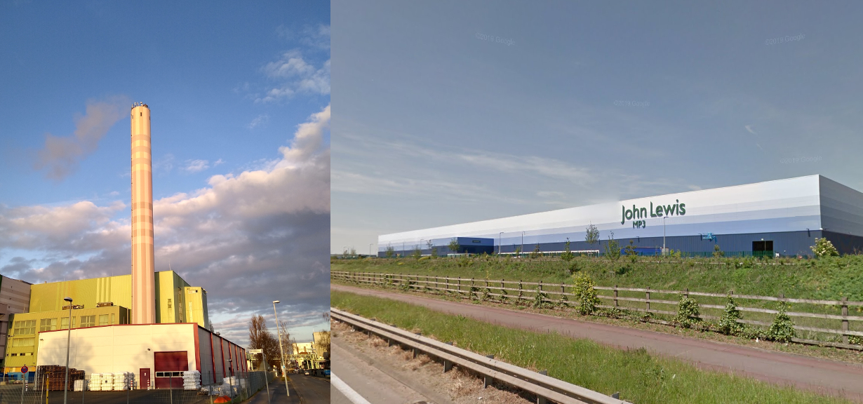
I notice something yesterday about the clever colour scheme used on this chimney near where I work (part of a rubbish collection centre). The soft pastel colours almost seem to change shade with the sky, and the crosshatch pattern helps to break up it’s silhouette. Together these features really help to make it a less imposing feature of the skyline. It reminded me of a Homestore distribution centre back home where a clever colour gradient does much the same (image source: Google Streetview).
Whilst this is probably well known to those in the business, this is the first time I’ve personally noticed how much colour and pattern can do to make a building less imposing than more.

